Assignment 1 Results
Welcome to the results page. First, take a look at the slideshow video below to find out what place you ended up in!
Now that you've watched the slideshow, take a look at your scores and comments from the judges.
Your comments are listed in the order you submitted, not in the order you ended up!
Your comments are listed in the order you submitted, not in the order you ended up!
Lialia54 & Nina Opal
69 points

Photo Quality: 7/10
Photo Presentation: 4/5 Overall Creativity: 10/15 High Fashion: 6/10 Judge's Preference: 7/10 Total: 34/50 Nina looks beautiful in this photo – she’s got a very “girl-next-door” vibe going on and she’s adorable. The look on her face is a good one and this is a good angle for the photo. Not every headshot has to have eye contact, but you do have to angle it properly so that the glance sideways looks intentional. You did well with that. I also like the vignette on the photo because it adds dimension to your background – it would have been very bland otherwise. That being said, the quality is a bit downgraded here. There are some very choppy areas and some harsh contrasting going on – I think that has to do with the sharpening done during contrast manipulation. It’s not as high fashion as I’d hoped for, but it’s a nice start. |

Photo Quality: 6.5/10
Photo Presentation: 4.5/5 Overall Creativity: 10/15 High Fashion: 7/10 Judge's Preference: 7/10 Total: 35/50 So first let me say I really love that you didn't put this on a completely solid background, that you added the lights and shadows behind Nina. It also goes well enough with the position of highlights on her face. Your use of contrast is interesting and I have to say I kind of like it. You've got some REALLY choppy edges, particularly with the hair and the hair ribbon. Do you have anti-aliasing on? That generally helps with that problem. I don't know if you cut her out because I don't model with Sims 4 but taking a soft eraser in your editing program to smooth out some of the choppies can help too if you cut her out and put her on a background. Her styling doesn't seem as much high fashion; more like demure and feminine. High fashion is all about going over the top. The makeup's pretty close though and I think it'd have packed more of a punch with a little eye contact with those great smokey eyes! As it is right now she looks very shy. So basically just watch your edges and remember high fashion. |
NShipp & Cecilia Grace
72.5 points

Photo Quality: 7/10
Photo Presentation: 4/5 Overall Creativity: 10/15 High Fashion: 7/10 Judge's Preference: 7/10 Total: 35/50 Cecilia’s makeup is nice and her accessories are good. The hairstyle is probably a really good one, but with the lack of depth to the image, I can’t see any detail – it’s just a black swatch of shape on her head. Some shading could have been added in an editing program. The background is fine, but the cropping of the image looks unfinished. I definitely would’ve cropped the final image tighter. There’s no real need for much of the background to be in the shot in this kind of headshot – tighter the better. |

Photo Quality: 7/10
Photo Presentation: 4/5 Overall Creativity: 11/15 High Fashion: 8.5/10 Judge's Preference: 7/10 Total: 37.5/50 I really like how you managed a high fashion look with sleek hair and those accessories. Wish I could see the earring a bit better though because all I can really see of it is the hook. So you have a lot of negative space in this photo. I'd have cropped it into more of a square to get rid of some of the empty space on the sides, because it makes the picture look a bit unfinished, even though technically it isn't. If that makes any sense. The background is also not the best quality; it's registering in pixelated rings that detract from the quality of the finished picture. Your sim is very clear and well put together, though. And she's one beautiful lady! |
SimmerMoon & Esme Platt
83.5 points

Photo Quality: 9/10
Photo Presentation: 4.5/5 Overall Creativity: 13/15 High Fashion: 8.5/10 Judge's Preference: 9/10 Total: 44/50 I really like this photo. You did something creative with the glitter/snow effect on the background, your model is styled really well, and the pose is interesting. I really like this image and have no real complaints – maybe the quality of the image seems a bit degraded due to over-sharpening? But that’s about my only issue – oh and the white left on Esme’s hair from being cut out. Great work, overall. |

Photo Quality: 7/10
Photo Presentation: 5/5 Overall Creativity: 12/15 High Fashion: 7.5/10 Judge's Preference: 8/10 Total: 39.5/50 Woah, talk about a cute face! Esme's freckles are adorable. Beautiful eyes too. I'm stealing her. One of the things I notice though is that she has some super white parts around her hair and body where I'm guessing you cut her out to put her on a background. Just kind of takes away from the quality a bit. Fingers and shoulders are a bit choppy too and I'd recommend taking a REALLY small brush on blur in your image editor and following along them with it. Mainly though while her jewelry and expression and pose are really cute, it kind of misses the high fashion mark for me. A more fierce pose would have been spot on. |
SimsORIGfan & Lexx Weinstein
85 points
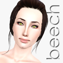
Photo Quality: 8.5/10
Photo Presentation: 4/5 Overall Creativity: 12/15 High Fashion: 8/10 Judge's Preference: 8/10 Total: 40.5/50 Lexx is such a stunner! I really like this model so much – her eyes are stunning (even in black & white). I like the accessories, makeup, and styling – it all looks high fashion. Lexx’s eye contact is also so beautifully captured and she looks fierce. The only complaint I think I have is where her hands are positioned. This pose would be great for a waist-up shot – something that’s pulled back a bit more to show more of your model, but for such a closely captured photo, the hands are awkward. They appear out of nowhere and we don’t see her arms so they’re oddly just there in her face. I think Lexx’s expression is perfect, but I’m not a fan of the hand placement. |

Photo Quality: 8.5/10
Photo Presentation: 5/5 Overall Creativity: 13/15 High Fashion: 10/10 Judge's Preference: 8/10 Total: 44.5/50 All RIGHT! This is what I'm talking about. Lexx looks super high fashion and like a classic beauty and that eye contact is great. I really like the sort of dynamic pose. But watch out for clipping -- that bracelet cutting into the palm of her hand does not look comfortable. Sometimes nixing an accessory or something for that reason is best. Or if you're adventurous, you can use the clone stamp tool in your editing program to kind of re-draw the part of the thing that got clipped. Overall though this is really nice. |
Cheeky & Willow Lovelace
80.5 points

Photo Quality: 7.5/10
Photo Presentation: 4/5 Overall Creativity: 11/15 High Fashion: 7/10 Judge's Preference: 8/10 Total: 37.5/50 I adore the direct eye contact (kind of my thing with headshots) and Willow’s eyes are gorgeous here. Even in black and white we see some depth to them and I’m excited to see them in color. I like that we also see some detail in her hair (a lot of models have lost detail in their hair this round). Shading and lighting is nice here, but I think what gets me about this one is the quality of the pattern on her sleeves. I think this would have benefited from her arms being bare. But that’s my nitpickiness. You did well. |

Photo Quality: 8.5/10
Photo Presentation: 4.5/5 Overall Creativity: 13.5/15 High Fashion: 8/10 Judge's Preference: 8.5/10 Total: 43/50 Man, Willow's eyes look like they're probably made of diamond! So pretty! So basically, I love this shot you've given us. Your styling of your model is unique and feminine, and I like that. There are really only two things ish I'm not digging. First is a really minor thing -- her nose, the lines around it, seem quite harsh. It looks like a nose mask that may not be matched to her skin as well as it could be, but that's a personal opinion. The other thing is the stark whiteness of the background. Willow is a pretty pale gal from what I can tell and she might stand out better on a background that is a medium shade of grey. That and there are parts of her sleeves that aren't defined against the backdrop so you can't tell where the background ends and the sleeve design begins. I think this really would have nailed everything if you'd played around a bit more with shadows. Play with lighting in game, and see what you come up with. The contrast you do have is really nice though and is definitely a step in the right direction! |
Abel & Nina Reese
91 points

Photo Quality: 9.5/10
Photo Presentation: 5/5 Overall Creativity: 13.5/15 High Fashion: 9/10 Judge's Preference: 9/10 Total: 46/50 Wow, Abel! I really love this photo – it’s my favorite of the round. Nina is such a gorgeous girl and I love the detail in this image. Even in black and white we see so much detail throughout – even the setting is nicely detailed! I love that eye contact – her eyes are stunning. Great job this round – you are starting us off with some major bang! |

Photo Quality: 9/10
Photo Presentation: 5/5 Overall Creativity: 13.5/15 High Fashion: 8.5/10 Judge's Preference: 9/10 Total: 45/50 Wowzers. Nina is quite a gorgeous lady and if it's okay with you I'm just going to steal her. XD Don't worry, I'll take good care of her lol. So anyway, LOVE the smoldering eye contact! Actually the only way her facial expression could have been better is if you took the liquify feature on your image editor and nudged her mouth corner up a bit to give her a cheeky smirk. You seem to have cut her out quite well and there are a few places I can see where you adjusted for choppiness, and that's great! Just remember to take the SMALLEST brush size you can when you iron out the choppies. You are kind of the weird one (not you PERSONALLY) but that you managed to give her a toned-down, classic look while still technically falling in the high fashion realm. I think it's the perfectly set-up makeup. Only thing is this was supposed to be no lower than the shoulders and you hit just a tad too low. When I think shoulders-up shot, I think less chest visible. But it's not a really bad thing because I think you cropped her at a flattering location. Just technicalities x.x I really like the background you put her on. Simple yet interesting. Great job! |
Bob & Aria Black
85.5 points

Photo Quality: 8/10
Photo Presentation: 4/5 Overall Creativity: 12.5/15 High Fashion: 9/10 Judge's Preference: 8/10 Total: 41.5/50 Aria is gorgeous. I love the direct eye contact here, the use of great dynamic lighting, and how she looks high fashion. I’m not a huge fan of her hand placement – I think maybe it’s overpowering and detracts from her gorgeous face. Her hand NOT being there or being at the bottom of the image, just barely peeking through, would have been better. I like how you also seemed to add a soft glow to the image. It was a unique idea and softened the photo. Nice job. |

Photo Quality: 9/10
Photo Presentation: 4.5/5 Overall Creativity: 13/15 High Fashion: 9/10 Judge's Preference: 8.5/10 Total: 44/50 Hi Bob. Didn't see you there, was too enamored with Aria. What I love most about your photo is the pretty shadow play against the background. Particularly in the bottom left and upper right corners of the photo. You worked the lighting as it would realistically be were this a real life photo! But the lighting is really bright and harsh on the middle parts of the photo. It may not even be the lighting as much but a lack of contrast. Maybe a red lip or at least a somewhat more rosy color which would register a bit darker in black and white, and a slightly darker color to her nails than she has now, would have upped the contrast and made things so much easier to distinguish. Those eyes and brows though, you did PERFECTLY. The eye makeup plus the necklace and strappy top push it into high fashion quite nicely. Though I think makeup wise also a little cheek contouring and shadow would have made her flipping flawless. You did an awesome job though and I'm glad to see you still active in the modeling community! |
Socal & Autumn Cash
77.5 points

Photo Quality: 8/10
Photo Presentation: 3/5 Overall Creativity: 10/15 High Fashion: 7/10 Judge's Preference: 7/10 Total: 35/50 Autumn is very cute and I like the makeup you have on her. Typically, I’d complain about the graininess of the image and chalk it up to over-sharpening or a quality issue, but because she has those tats, comes off as somewhat of a bada$$, I think it fits. It fits the whole grungy vibe you have going on in the image. I like the vignette also as it draws all of our attention to Autumn. It isn’t as high fashion as I’d hoped and I find it to be a simple and safe entry, but not a bad one. |
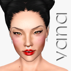
Photo Quality: 8/10
Photo Presentation: 5/5 Overall Creativity: 13.5/15 High Fashion: 8/10 Judge's Preference: 8/10 Total: 42.5/50 Autumn looks like she did something DEVIOUS. Which is awesome. She's a girl after my own heart. You know the quote: well-behaved women rarely make history. XD I love all her tattoos. I love a tattooed sim. I also love the sleek hair with what looks like a sequinned dress! Her makeup is very classy as well, but I'm not a big fan of the little dots on her upper eyelids with the look. It seems a little overkill, no matter how subtle they are. I do absolutely love the halo of light around Autumn, though. I'd have liked to see a bit more shadow play with her face and such. Shadows can make a black and white photo just POP. I think this picture would have done very well with a more direct light source coming from some direction or another and some nice shadowing. But I love this regardless. |
Maggie & Rachel Applegate
92 points

Photo Quality: 10/10
Photo Presentation: 5/5 Overall Creativity: 13/15 High Fashion: 9.5/10 Judge's Preference: 9/10 Total: 46.5/50 You never cease to amaze me, Maggie. Rachel is not only stunning, but beautifully posed/styled here. I have seen most of your models and loved them all – but I think Rachel is a new favorite. She’s gorgeous – even with one eye ;) I like that we still see detail in the eyeshadow and lipstick – while in black and white. Her hair is cute too! I don’t have any real complaints, nice job. |

Photo Quality: 10/10
Photo Presentation: 4.5/5 Overall Creativity: 13/15 High Fashion: 9/10 Judge's Preference: 9/10 Total: 45.5/50 New sim from you, yay! I mainly love the makeup in this photo. It's so interesting to look at. And I mean I may be biased because I am all about some glitter makeup irl lol. You did a pretty good job playing with shadows but it would have been really cool to see just a tad more contrast; I find that's what makes for the most enchanting black and white photos. You don't want to overdo it of course, but I'd have darkened her just a tad coming from the top left side of the photo where the background is more shadowy than the rest. That's really minor though. I'm not a fan of the angle, honestly. It's not bad but it's kind of a little off, like maybe I'd have gone a little more daring and done a steeper angle (and I know you can do that cause you do it all the time and it's amazing) and that would have upped some of the punch the picture packs. Nonetheless, Rachel is gorgeous and you did a great job! |
wrswrs2 & Victoria Berman
76.5 points

Photo Quality: 9/10
Photo Presentation: 4/5 Overall Creativity: 11/15 High Fashion: 7.5/10 Judge's Preference: 7/10 Total: 38.5/50 Victoria is a gorgeous girl. Here’s what I love about the photo – Victoria’s hair, her makeup, the angle of the shot, and the lighting (how it’s brighter near her face and darkens as we move to the left of the photo. Here’s what I didn’t love – the pose isn’t my favorite simply because what it does to her lips, the simplicity of the image is nice, but it detracts from the high fashion requirement, and the cropping could have been closer. It still would have been a stunning image if you had cropped a bit tighter on the right side. Good work, overall! |

Photo Quality: 9.5/10
Photo Presentation: 4/5 Overall Creativity: 11/15 High Fashion: 7.5/10 Judge's Preference: 6/10 Total: 38/50 Victoria is gorgeous! However, while her hair is definitely high fashion, and her eye makeup can pass, her facial expression is definitely not. For instance, you've left a lot of negative space on the right hand side of the photo, but cut off the top of her head. When I judge headshots, I generally don't like the top of the head cut off if it's just a small amount. I like to see either a super close shot, or one that shows the entirety. I feel like Victoria's expression could have been super fierce from a different angle, but from the one you have, she just looks like she's not sure what's going on so is frowning about it. I'm not a stickler for eye contact by any means, but Victoria looks kind of like she's not sure what's going on. Also remember high fashion is kind of out there. The tank top isn't doing it for me. |
Jojo & Udele Avdeyev
86 points

Photo Quality: 9.5/10
Photo Presentation: 3/5 Overall Creativity: 12/15 High Fashion: 9.5/10 Judge's Preference: 8/10 Total: 42/50 Okay, you know I love your work and your unique and STUNNING models. Udele is just as stunning as your others and I love the direct eye contact in this shot. I also adore the tight cropping of the image. This is a highly detailed and beautifully constructed image. Good work. But those hands…I wish they weren’t in the shot. I think this photo would have been perfect without her hands being there. They aren’t as good of quality and they cover too much of her that it detracts. But, aside from that, this is rockin! |

Photo Quality: 9.5/10
Photo Presentation: 4/5 Overall Creativity: 13/15 High Fashion: 8.5/10 Judge's Preference: 9/10 Total: 44/50 I think that you did some of the best shadow-play out of all of the entries. However, I think if you were going to add in the arms (wrists, hands, etc) I'd have liked to see some pretty neat-o accessories. A statement ring, a jeweled bracelet, something. You're one of the few to do the cutting off the top of the head well, but unfortunately it looks like you went a little too far down -- this was to be a shot no lower than the shoulders, and while Udele's hair is in the way, I can tell it's a bit too far down toward the chest. The makeup is spot-on though and Udele looks gorgeously into the audience's eyes. I think the hands there kind of threw it off, though. They make her look kind of shy, and reserved, and that's not really conducive to high fashion, where it should be fierce and confident. Hands are all right if they're not covering the face so much. But overall I really loved this photo. |
Gramatique & Imogen Peak
96.5 points

Photo Quality: 9.5/10
Photo Presentation: 5/5 Overall Creativity: 14/15 High Fashion: 10/10 Judge's Preference: 9.5/10 Total: 48/50 Wowza Gramatique! Imogen is so beautiful here and you really nailed the whole idea of high fashion black & white. You mastered the lighting dynamics and made it a very interesting photo to look at. Imogen is styled beautifully – that hair!!! – and her makeup is simple, but refined. I also adore the over-the-shoulder pose. I only wish she weren’t frowning. A smile our slightly parted mouth would have been perfect. Great, great work! |

Photo Quality: 9.5/10
Photo Presentation: 5/5 Overall Creativity: 14/15 High Fashion: 10/10 Judge's Preference: 10/10 Total: 48.5/50 Okay so heck yes. I think you nailed high fashion, black and white, and playing with shadows all wonderfully. You get the only 10 for judge's preference that I'm awarding this round! And the only reason you don't get a 10 for quality is because some of the hair is kind of... stiff. Maybe take a hair brush in your editing program and brush out some of the ends particularly in the spots that have super hard edges. Even with a ton of hair spray, no one's hair is going to not move a bit. You played with shadows gorgeously and Imogen definitely looks like a classic beauty. Just... everything about this photo is just flipping gorgeous. The literal only thing I can think of would be to stick a pearl or diamond necklace on her to peek out from the back of her neck that you've shown. Just remember that sometimes an accessory can make or break a photo. The lack thereof didn't break this, but if it were included it would have been stunning. |
Mizzie & Melina Ross
93.5 points

Photo Quality: 10/10
Photo Presentation: 4.5/5 Overall Creativity: 13/15 High Fashion: 9.5/10 Judge's Preference: 9/10 Total: 46/50 This is a stunning entry. I really love how dynamic the lighting is – which isn’t easy to accomplish with black & white. The pose was a beautiful one and the emotion that’s present on Melina’s face is amazing. Great job with the hair too! I honestly loved this photo. Great job. |

Photo Quality: 10/10
Photo Presentation: 4.5/5 Overall Creativity: 15/15 High Fashion: 9/10 Judge's Preference: 9/10 Total: 47.5/50 Oh man, Mizzie, you are the queen of dynamic poses! I see this almost like Melina surfaced from the water, shook her hair out, and now it's laying out in its natural arrangement. The eye makeup is just gorgeous. I absolutely love that you were able to pull of a very high fashion, very classy, very nice black and white, without the eyes even being remotely open, let alone staring into the camera. The only thing is it's not as close of a headshot as I was thinking it should be, per the assignment requirements. If Melina would have filled out the canvas a little more, you'd have gotten me to faint on the floor until my cats licked me to death and then I would die, and that would be that lol. So yeah my only complaint is I wish it would have been a bit closer up. But congrats, here's the only full score creativity I'm giving to anyone this round, because your angle and pose was just so... wow. Just awesome. Very dynamic, very dramatic, very lovely. |
YJB19299 & Ashanti Jowhar
75.5 points

Photo Quality: 7/10
Photo Presentation: 3/5 Overall Creativity: 11/15 High Fashion: 8/10 Judge's Preference: 6/10 Total: 35/50 I really like the creativity of this image and the fact that you styled Ashanti in such a pretty way! I really like her whole look. The pose also rocks. Here’s where I get caught up – the lighting is far too harsh and dark (we can’t really see her headpiece/hair at all), the cropping should be a bit tighter, the quality of the photo is very off and pixelated, and the requirements stated no lower than the shoulders – this is quite a bit lower. |

Photo Quality: 8/10
Photo Presentation: 4/5 Overall Creativity: 12/15 High Fashion: 8.5/10 Judge's Preference: 8/10 Total: 40.5/50 Oh man, Ashanti is flipping gorgeous. And I think you nailed high fashion with her! The makeup and jewelry are all very nice! The first thing I see though is that this photo was supposed to be no lower than the shoulders, and we can see quite a bit of Ashanti's chest. The only other thing is that the background may actually be too dark; it's hard to see her lovely natural hair against this background. I love that you did an angled light source from the upper left corner of the photo as it makes her cheek contour super fierce. There is a lot of pixelation and jagged edge on her arms, though. Be careful of that. I'm honestly not sure how to get rid of that in a cut out Sims 4 sim as I don't model in Sims 4, but I know Mizzie and a few others can help you there. What I do know is that you can take a super tiny blur brush and just go down the actual line. Anyway, you did really awesome! |
